edited by Mike Aling and eye try, published by Breite Gasse Publishing, launched at the Silver Linings show at the Academy of Fine Arts Vienna, Graphic Design: Mike Aling


This publication is not a catalogue, it is rather a project: it is a space in the form of a book. 92 pages, full colour.
Since modernity has come into existence, standardisation, serialisation and typisation have been part of architectural design. Thus, for this publication project, relying on standardised production processes did not seem far-fetched – at the same time it was paramount to play with them and subvert them.
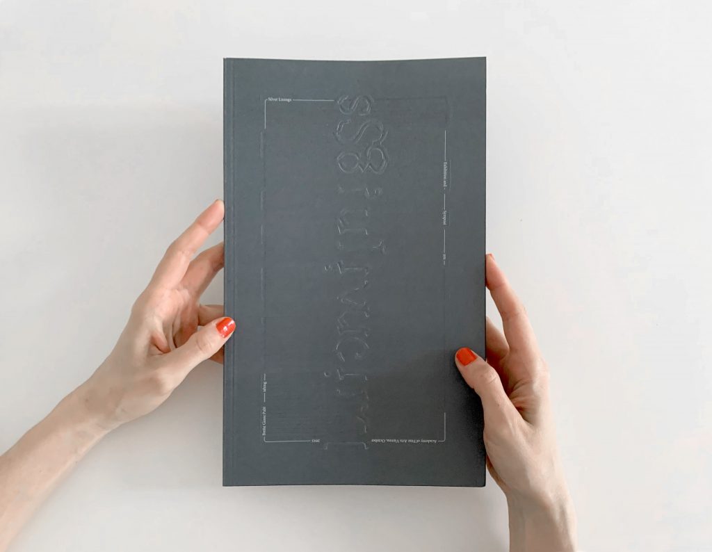
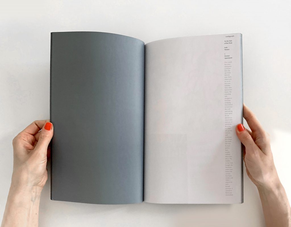
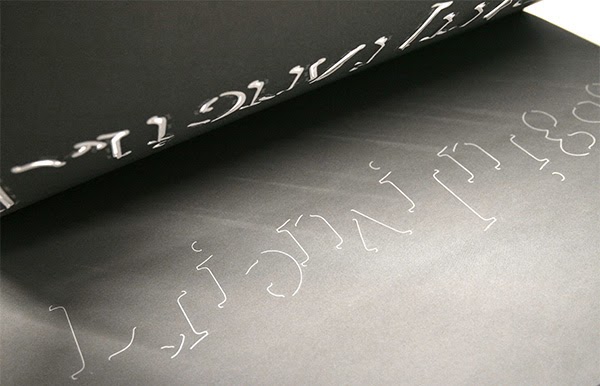
The cover is laser cut, the edges are sprayed in the cover’s colour. The book presents itself as coloured box, whose contents are only very partially revealed through the cuts in the cover. Inside the book, readers may engage with the sheets: the pages are never conceived as single surfaces, but rather as an object, having a back and front. The semi-transparent nature of the paper is taken advantage of, letting content from the back side shine through. Those transparencies inform the book’s design, treating the pages not as seperate elements but conceiving of a multiplicity of sheets.
The publication is an additional layer that needs to be thought altogether with the exhibition space. Containing 12 projects ordered alphabetically after their project title, the book suggests a route one may take in the exhibition space. An offer of a possible itinerary, given to the visitors. Faint photographs in the book suggest positions in space that might be actively embodied by the visitors, revealing links to other projects, creating a before and after.
In addition to the projects the book features a text written by artist Seth Weiner, who accompanied the process of making an exhibition from the beginning onwards. His text provides another, alternative view – meandering through the pages‘ margins.
